A few days back I published an article on including more subject data in a Waterfall graph. This was motivated by the desire from many users to view more data in the same graph, thus avoiding the need to refer to different graphs for the relevant information. In this case, I started from the traditional data used for a Waterfall graph, and added relevant new data columns to create the graph. These graphs were presented in a paper at PhUse 2018.
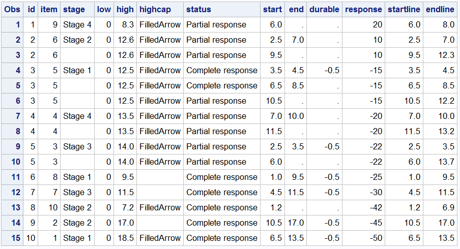
In this article, I want to present a different approach to the same idea, starting with the data for a traditional Swimmer Plot. I will add the relevant information for "Change from Baseline" of tumor data, Lesion type, etc, sort the data by best change from baseline and display both the Waterfall data and Swimmer data in the same graph. The data set sorted by response is shown below.
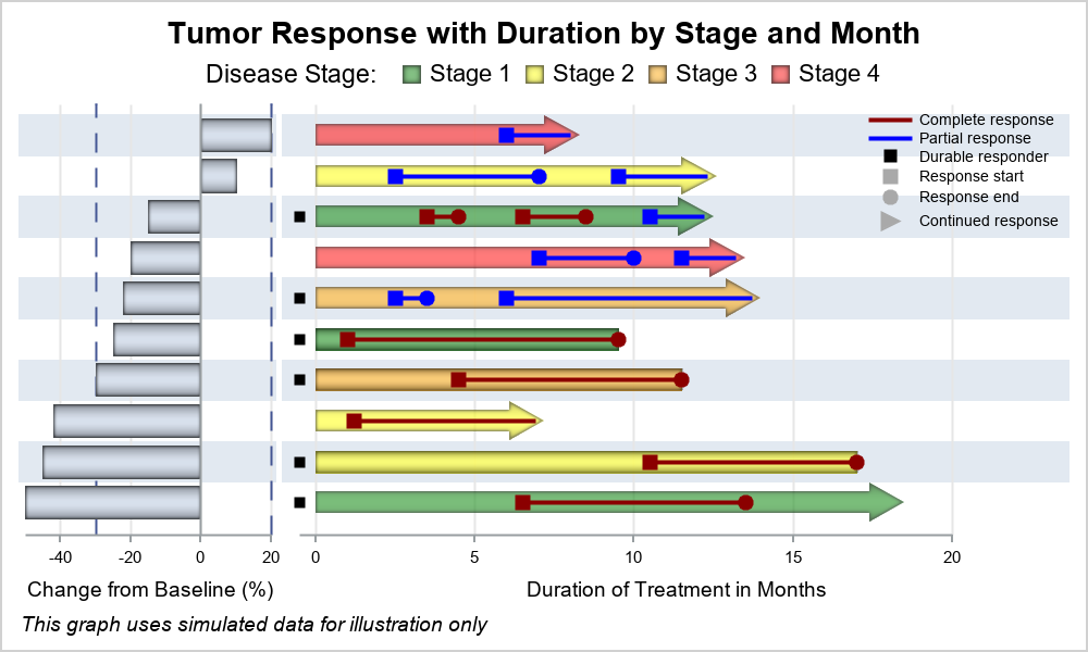
Now, we can create a 2-column graph where we can display the "Change from Baseline" data in the left cell in a vertical orientation where the response values are shown as horizontal bars. The associated Swimmer plot information is displayed in the right cell in the traditional Swimmer Plot orientation.
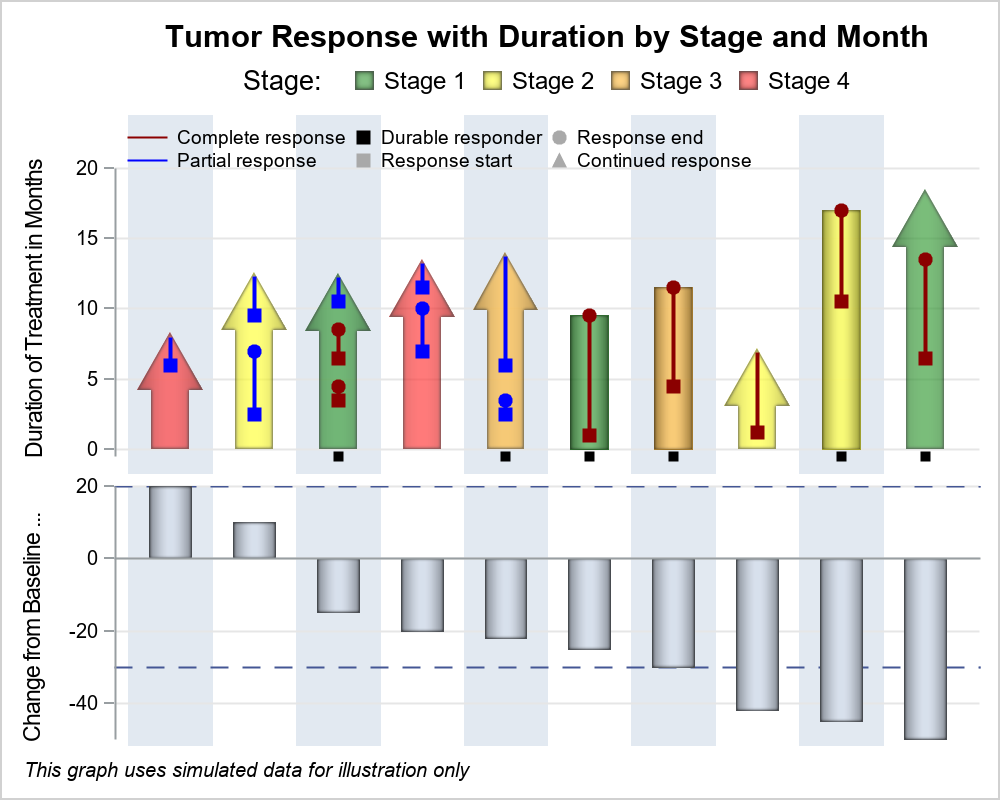
Alternatively, we can flip the orientation of the graphs, creating a graph with two rows. We can display the "Change from Baseline" information in the traditional Waterfall orientation in the lower cell and the Swimmer Plot information in the upper cell, in a vertical orientation.
Full GTL programs for the graphs above: SwimmerPlus


9 Comments
Very nice. Thanks.
Thanks Sanjay... Love your posts; super informative.
There is a WARNING: The data for a BARCHARTPARM statement are not appropriate. The
BARCHARTPARM statement expects summarized data. The bar chart might
not be drawn correctly
it looks will not affect the output, but need confirm with you whether it's OK .
The BARCHARTPARM is designed for non repeating data for the same category. In this graph, some ID values are repeated due to the multiple response episodes in the Swimmer part. The warning message is displayed, but since the Response value for each episode is the same, the graph is correct. The BARCHARTPARM can be replaced by BARCHART statement below with STAT=MEAN to give the same results without any warnings. Note, the RESPONSE values for the repeated ID values could be set to missing for safety.
barchart category=id response=response / barwidth=0.5 dataskin=pressed stat=mean;
just one question, how to hide your X-axis line in your second graph? I tried many methods but didn't achieve that.
See the setting DISPLAY=none in the COLUMNAXIS statement.
layout lattice / columndatarange=union rowweights=(0.6 0.4) rowgutter=0;
columnaxes;
columnaxis / display=none type=discrete discreteopts=(colorbands=odd colorbandsattrs=(transparency=0.1));
endcolumnaxes;
Hello, would you please tell me how to hide the line of X-axis in your second graph ? I cannot figure which part in your code can achieve this.
Thanks.
See the setting DISPLAY=none in the COLUMNAXIS statement.
layout lattice / columndatarange=union rowweights=(0.6 0.4) rowgutter=0;
columnaxes;
columnaxis / display=none type=discrete discreteopts=(colorbands=odd colorbandsattrs=(transparency=0.1));
endcolumnaxes;
very beautiful.